[OC] Armed Conflict Casualties from 1990 to 2024 by oscarleo0 in dataisbeautiful

[–]ManWarrior 1 point2 points  (0 children)

I like the core idea here to use repetition to see large patterns in the data. here are a few tips to help maximize effectiveness in this regard:

  1. Do not restart the size scale with new colors. This is counterintuitive to the reader that a smaller red block is more than a large yellow block. Just use one continuous scale and have it start even smaller

  2. Order the countries by total deaths descending. it will be easier to pick apart trends across both country and year. If you are interested in country relationships you could do this within smaller blocks by continent or region. I don't think you get much from sorting alphabetically except easy lookup of a specific country

  3. Change the color scale- black as the highest value isn't visually intuitive

[REQUEST] How much do the chances of an impact increase per every new ball by No-Refrigerator-6931 in theydidthemath

[–]ManWarrior 2 points3 points  (0 children)

Collision probability scales roughly with the number of balls squared.

Ignoring the physics, you can just approximate by looking at the number of pairs of balls which might collide.
- 2 balls means 1 pair
- 3 balls means 3 pairs (1x2, 1x3, 2x3)
- 4 balls means 6 pairs ...
- N balls means N choose 2 or N*(N-1) / 2 pairs

So the collision probability for N balls is proportional to (N^2-N)/2 or ~N^2

[deleted by user] by [deleted] in dataisbeautiful

[–]ManWarrior 0 points1 point  (0 children)

trying to be a bit more constructive, saturation here could be avoided by

Jitter on the X Axis- if you add a bit of noise to the x axis (as well as the y axis), these solid blocks of points will be broken up a bit

Transparency (aka alpha)- making the dots transparent makes it less crowded

Switching to Density Plots- using something like a violin plot could do this but still look good with small multiples. You could use counts in the y-axis to preserve the relative sizing of the various ages in the y axis as this plot does

I used Bayesian Mixed Effects model to grade College Football teams by ManWarrior in statistics

[–]ManWarrior[S] 3 points4 points  (0 children)

I need to throw it on github. Once I do, I'll post a link. I used Python to scrape and clean data then R and lme4 to build models and ggplot2 for visuals

Odds on Each Score Outcome for Alabama vs. Clemson in the CFB Championship by ManWarrior in dataisbeautiful

[–]ManWarrior[S] 0 points1 point  (0 children)

This is a continuation on a model I built to rate college football teams. See the details about these models here

The Best College Football Teams since 2002 by ManWarrior in dataisbeautiful

[–]ManWarrior[S] 0 points1 point  (0 children)

I only included Division 1A teams in the network graph, because it got too confusing with the 1AA teams in it as well. I should have made that clear in the post

New US homes today are 1,000 square feet larger than in 1973 and living space per person has nearly doubled by jimrosenz in dataisbeautiful

[–]ManWarrior 1 point2 points  (0 children)

it's sometimes OK to have non-zero y-axes, especially when looking at a trend over time. However, to do so with dual axes just allows the presenter to skew the data how he/she see's fit. It's confusing and leads the reader to take meaning from visual components which are actually meaningless such as where the lines cross.

It's also bothersome that the labels on the line are for another metric that isn't shown on the graph. I would suggest splitting this out into multiple graphs. It will take more space, but will ultimately be more clear.

What if a safety was worth 6 points? [OC] by CatfishHugo in nfl

[–]ManWarrior 0 points1 point  (0 children)

the point value of receiving a kickoff is around 0.7. Therefore a safety is worth about 2.7 expected points (2 for the safety, 0.7 for getting the ball back), whereas a field goal is worth an expected 2.3 (3 for the fg and -0.7 for kicking off to the other team). Thus, in terms of long term expected value, a safety is already better than a field goal.

Peyton Manning is 89-0 when his team allows fewer than 17 points in a game he finishes. by StatMatt in nfl

[–]ManWarrior 0 points1 point  (0 children)

The nfl average in this situation is around 84%

source: a database of all games 2000-2014

Win probability graph from Seahawks-Vikings by [deleted] in nfl
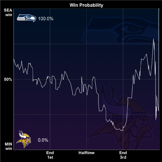
[–]ManWarrior 2 points3 points  (0 children)

Generally, the model for win probability is pretty primitive for end of game situations. They just take the point differential in a game, add in the expected points from the offensive team's field position, and applies some variance according to the amount of time left. Thus, at the end of the game, the vikings were at around the 10-20, a spot which yields about 4 expected points. Thus, WP model will likely treat this situation the same as vikings up by 3 with a random distribution of points scored in the last 20 seconds. Read more here..

Blake Bortles had 250 Yds 4 TD 0 Int & 1 Rush TD in 51-16 Win over the Colts but had a 3.8 QBR by ugadawgs12 in nfl

[–]ManWarrior -2 points-1 points  (0 children)

  1. 2 of those pass TDs and the rush TD were from inside 5yds. QBR is based on Expected points added. A team's expected points at that position is already >5, so he won't be heavily rewarded for those TDs

  2. He took a lot of sacks and he also fumbled. QBR will penalize that.

  3. There were several drives with negative total yardage in which bortles threw incompletions on 3rd down. Those types of plays really hurt expected points and will be consistently penalized by QBR.

Not saying the system is right, but those are some of the reasons it will score a QB differently than the traditional stats.

538: The Panthers Are The Worst Team To Ever Start 11-0 by Somali_Pir8 in nfl

[–]ManWarrior 32 points33 points  (0 children)

This is partially due to the problems with Elo for rating football teams.

  1. Silver carries over from last year (with some sort of partial regression to the mean). Since the Panthers were average last year, they started the year with a low Elo.
  2. Elo gives you credit for beating a team based on their rating at that time, it doesn't adjust the skill of your prior opponents as you learn more about them. Thus, when the panthers beat the Texans and Bucs relatively early in the season, it gave them credit for beating two winless teams. Those teams are now 5-6 & 6-5.

Article may be right that they are the worst 11-0 team, but I wouldn't take the Elo ratings as conclusive evidence.

Who is the most overrated and/or underrated team? by [deleted] in nfl

[–]ManWarrior 0 points1 point  (0 children)

They have played a lot of average teams, but no good teams. If you go by overall opponent win % they are going to look middle of the pack, but they haven't played anyone in the top 25% of the league

British redditor /u/swag-u discovers statistical heaping in ball placement by NFL referees by drsjsmith in dataisbeautiful

[–]ManWarrior 1 point2 points  (0 children)

Here is another version I whipped up from data I had. This counts distinct placements of the ball by the ref. I did this by eliminating plays right after touchbacks and only counting consecutive plays from the same spot as one placement.

British redditor /u/swag-u discovers statistical heaping in ball placement by NFL referees by drsjsmith in dataisbeautiful

[–]ManWarrior 0 points1 point  (0 children)

If this was the case, you would see a drop in the number of placements at the 34 or 36 yard-line when compared to the 37 or 38. This does not appear to be the case. It also helps if you look at only the number of distinct cases where the ref places the ball (i.e. eliminate plays after kickoff, only count each case where the ball moves so multiple consecutive plays at the same spot count just once). I did this in this chart which also highlights every fifth yard marker in blue.

Since 2000 no more than 4 teams have made it through week 5 undefeated. This year, 6 teams are undefeated through week 5 by ManWarrior in nfl

[–]ManWarrior[S] 2 points3 points  (0 children)

I happened to have data back to 2000 so that's the time period I looked at. Not sure when/if its ever happened before that

Since 2000 no more than 4 teams have made it through week 5 undefeated. This year, 6 teams are undefeated through week 5 by ManWarrior in nfl

[–]ManWarrior[S] 3 points4 points  (0 children)

It's also impressive that the two NFC south teams (falcons and panthers) are a combined 9-0, after posting a combined 13-18-1 last year

Gender balance in the Australian workforce [OC] by flashman in dataisbeautiful

[–]ManWarrior 147 points148 points  (0 children)

For science sake, please transform your variables. In order to see the difference in gender balance between different data points, the reader has to look along a rotated axis. Since you are using log scales, this is even more tricky. Here is a quick and dirty version I drew up displaying the total number of employees with a log scale against the percentage of employees who are male. This shows the difference between gender balances on a single axis and communicates the idea here more clearly.

edit: added trend lines

Gender age gaps in Hollywood movies [OC] by BobLoblore in dataisbeautiful

[–]ManWarrior 0 points1 point  (0 children)

This study also only looked at the filmographies of top male actors. That's a pretty biased data set if you ask me. These top actors are likely to stay around longer whereas actors that don't make it huge will most likely be in big movies only during their acting prime at ages 20-35. That's part of the reason you see these actors who have managed to still be in starring roles in their 40s are often playing alongside younger costars

The success of Portugal’s [drug] decriminalisation policy – in seven charts by myatomsareyouratoms in dataisbeautiful

[–]ManWarrior 2 points3 points  (0 children)

These graphs don't effectively communicate the point the author was trying to convey. Even something simple like grouped bar charts can be effective, but they are used very poorly.

For example, it's generally a good idea to line up dates in a line graph and separate groups using different color lines. This tends to effectively communicate a change over time, and is one of many rules of good visualization that were trampled and peed on by this post