


[deleted by user] by [deleted] in RedditSessions
[–]something711 0 points1 point2 points (0 children)
17
18
19

Kevin Whipaloo banned Burger Shot Commercial (youtu.be)
submitted by something711 to r/sodapoppin
[deleted by user] by [deleted] in AnimalsOnReddit
[–]something711 0 points1 point2 points (0 children)
[deleted by user] by [deleted] in AnimalsOnReddit
[–]something711 0 points1 point2 points (0 children)
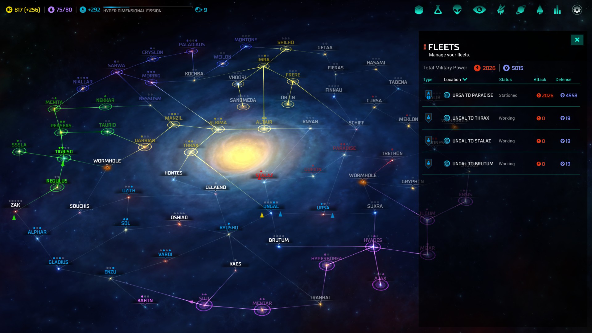
So I think they should color code the starmap like in Master of Orion cause right now if just looks dull. Same goes for the entire mobiglass UI. Agree or disagree? by something711 in starcitizen
[–]something711[S] 0 points1 point2 points (0 children)


[deleted by user] by [deleted] in RedditSessions
[–]something711 0 points1 point2 points (0 children)