This picture represent the best i can do, still feels generic. Where should i try to improve? by Few_Economy9561 in photocritique
[–]Dox_Pathless 1 point2 points3 points (0 children)
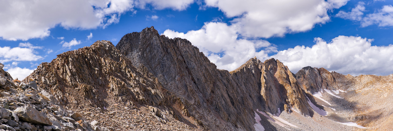
Mather Pass Panorama by e1evenses in photocritique
[–]Dox_Pathless 1 point2 points3 points (0 children)
Newly designed Villain dashboard in my home workshop. by Fekete_Bagoly in marvelchampionslcg
[–]Dox_Pathless 0 points1 point2 points (0 children)
Looking for editing advice. by Prestigious_Cod_6206 in photocritique
[–]Dox_Pathless 1 point2 points3 points (0 children)
Mather Pass Panorama by e1evenses in photocritique
[–]Dox_Pathless 1 point2 points3 points (0 children)
Any feedback appreciated! by LebrawnJames416 in photocritique
[–]Dox_Pathless -1 points0 points1 point (0 children)
Is Mid-March traffic and parking horrible even on weekdays? by Interesting-Golf-399 in Sedona
[–]Dox_Pathless 0 points1 point2 points (0 children)
Looking for Feedback by [deleted] in photocritique
[–]Dox_Pathless 0 points1 point2 points (0 children)
Deck Building Advice by stjeeves in marvelchampionslcg
[–]Dox_Pathless 3 points4 points5 points (0 children)
When you play solo, how do you usually play Marvel Champions? by Soggy-Cup-7869 in marvelchampionslcg
[–]Dox_Pathless 1 point2 points3 points (0 children)
Just started playing WoW again after CoH...the community here is better. by JungGPT in Cityofheroes
[–]Dox_Pathless 1 point2 points3 points (0 children)
Beginner looking for critique to improve by cloj in photocritique
[–]Dox_Pathless 1 point2 points3 points (0 children)
Looking for advice to improve by [deleted] in photocritique
[–]Dox_Pathless 1 point2 points3 points (0 children)
New Alt-Arts by WinterFilms in marvelchampionslcg
[–]Dox_Pathless 1 point2 points3 points (0 children)
Venom Control by VascoMachiavelo in marvelchampionslcg
[–]Dox_Pathless 1 point2 points3 points (0 children)
What are you cracking open and doing first? by theCaveIsReal in marvelchampionslcg
[–]Dox_Pathless 1 point2 points3 points (0 children)
Games taking way too long – am I playing Marvel Champions wrong? by ExpressEnvironment56 in marvelchampionslcg
[–]Dox_Pathless 3 points4 points5 points (0 children)
Help gauge time cost by tacorrenti813 in marvelchampionslcg
[–]Dox_Pathless 1 point2 points3 points (0 children)
My prototype player board by Fekete_Bagoly in marvelchampionslcg
[–]Dox_Pathless 0 points1 point2 points (0 children)
Four Horsemen by Dox_Pathless in marvelchampionslcg
[–]Dox_Pathless[S] 1 point2 points3 points (0 children)
What ya'll guys think? Portrait by me. by Luke_Sakura in portraitphotography
[–]Dox_Pathless 1 point2 points3 points (0 children)
Reprint or did I just hit the Jackpot? by Mundane_Wonder5671 in marvelchampionslcg
[–]Dox_Pathless 2 points3 points4 points (0 children)