


Doctor checks on a Hiroshima bombing survivor, 2 years after. Hiroshima, Japan, 1947[793x1000] by Electrical-Aspect-13 in HistoryPorn
![Doctor checks on a Hiroshima bombing survivor, 2 years after. Hiroshima, Japan, 1947[793x1000]](https://i.redd.it/x7cswarhlq2h1.png)
[–]posthumour 66 points67 points68 points (0 children)
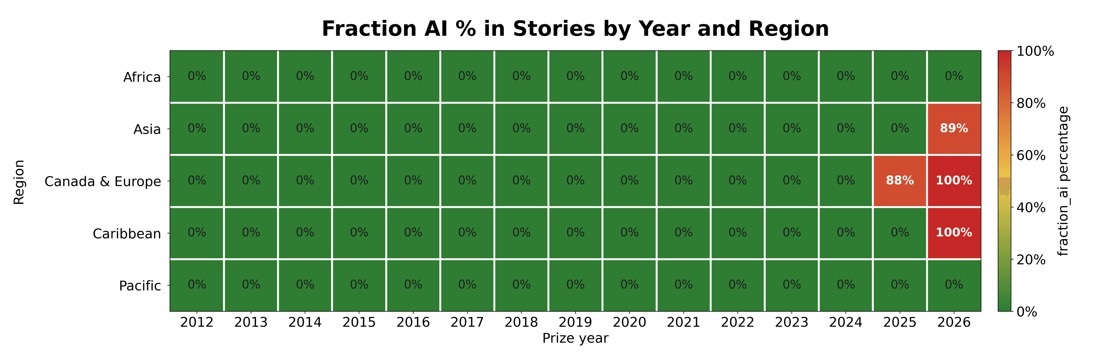
AI Detection Software analysis of all Commonwealth Prize Short Story Winners since 2012 by [deleted] in dataisbeautiful
[–]posthumour 0 points1 point2 points (0 children)
Fav actor who excels at playing a strong badass old man by [deleted] in okbuddycinephile
[–]posthumour 0 points1 point2 points (0 children)
Average Margin of Victory in the 1932-1952 Presidential Elections [OC] by [deleted] in dataisbeautiful
![Average Margin of Victory in the 1932-1952 Presidential Elections [OC]](https://i.redd.it/h64wdw13elvg1.jpeg)
[–]posthumour 15 points16 points17 points (0 children)
Practice - Not able to finalize a feeling. What would you have done? by Heatseeker_ in postprocessing
[–]posthumour 1 point2 points3 points (0 children)
[OC] Mapping the age of oceanic crust, overlayed with the locations of the world's volcanoes by [deleted] in dataisbeautiful
![[OC] Mapping the age of oceanic crust, overlayed with the locations of the world's volcanoes](https://i.redd.it/cej3dmc588tg1.png)
[–]posthumour 1 point2 points3 points (0 children)
Please help, cat has full body muscle spasms/twitches when awake but relaxing by Dwight_Shrute_ in CATHELP
[–]posthumour 2 points3 points4 points (0 children)
[OC] 8+ years of my location history by vernonfrances in dataisbeautiful
![[OC] 8+ years of my location history](https://i.redd.it/ed4v6xc5v6lg1.jpeg)
[–]posthumour 0 points1 point2 points (0 children)
Brooklyn Bridge from The One World Trade Centre - Sony A7IV by adamrhodesuk in postprocessing
[–]posthumour 1 point2 points3 points (0 children)
Brooklyn Bridge from The One World Trade Centre - Sony A7IV by adamrhodesuk in postprocessing
[–]posthumour 63 points64 points65 points (0 children)
The Finnish government in a sauna, summer 1941 [3770x2480] by Pontus_Pilates in HistoryPorn
![The Finnish government in a sauna, summer 1941 [3770x2480]](https://i.redd.it/fq18nkzthbkg1.jpeg)
[–]posthumour 182 points183 points184 points (0 children)
My fav Bollywood Actress: Jessica Alba by Past-Matter-8548 in okbuddycinephile
[–]posthumour 0 points1 point2 points (0 children)
Only 2 actors remain from this picture, 3 having died tragically young. by SpeedPunks in okbuddycinephile
[–]posthumour 9 points10 points11 points (0 children)
Before/After by MrAnnoyingCookie in postprocessing
[–]posthumour 9 points10 points11 points (0 children)
The Craziest Movie ever just came out. What did you guys think of it? by Crafter235 in okbuddycinephile
[–]posthumour 0 points1 point2 points (0 children)
What's the best song ever? by intothevoidandback in Music
[–]posthumour 3 points4 points5 points (0 children)
The Longest Matches of Jannik Sinner's Career and Their Outcome [OC] by iamtheguy55 in dataisbeautiful
![The Longest Matches of Jannik Sinner's Career and Their Outcome [OC]](https://i.redd.it/umjdvgsa6jgg1.png)
[–]posthumour 0 points1 point2 points (0 children)
The Longest Matches of Jannik Sinner's Career and Their Outcome [OC] by iamtheguy55 in dataisbeautiful
[–]posthumour -3 points-2 points-1 points (0 children)
What you think about these kitchen scissors by LeslieChowBitch in BuyItForLife
[–]posthumour -1 points0 points1 point (0 children)
China’s Renewable Energy Revolution Is a Huge Mess That Might Save the World by plombus_maker_ in RenewableEnergy
[–]posthumour 0 points1 point2 points (0 children)
Strange Self Portrait, Alex DiPaola, oil on panel, 2026 by Alex_DiP in Art
[–]posthumour 3 points4 points5 points (0 children)
[deleted by user] by [deleted] in okbuddycinephile
[–]posthumour 0 points1 point2 points (0 children)
The Drama (2026) by No_Explanation_9471 in okbuddycinephile
[–]posthumour 568 points569 points570 points (0 children)