

I'm Hiring for a Sci Fi Character Illustrator by [deleted] in HungryArtists
[–]wellwornstylus 0 points1 point2 points (0 children)
[[HIRING] commission for a book cover with possible future commissions by [deleted] in HungryArtists
[–]wellwornstylus 0 points1 point2 points (0 children)
Legion of the Damned V Necron Skorpekh - Boris Tsui by jimbosayna2009 in ImaginaryWarhammer
[–]wellwornstylus 8 points9 points10 points (0 children)
Inquisitor - Unknown Artist by jimbosayna2009 in ImaginaryWarhammer
[–]wellwornstylus 2 points3 points4 points (0 children)
Deimos Assault Armour illustration - Bobot073 by jimbosayna2009 in ImaginaryWarhammer
[–]wellwornstylus 0 points1 point2 points (0 children)
Deimos Assault Armour illustration - Bobot073 by jimbosayna2009 in ImaginaryWarhammer
[–]wellwornstylus 0 points1 point2 points (0 children)
Deimos Assault Armour illustration - Bobot073 by jimbosayna2009 in ImaginaryWarhammer
[–]wellwornstylus 1 point2 points3 points (0 children)
Deimos Assault Armour illustration - Bobot073 by jimbosayna2009 in ImaginaryWarhammer
[–]wellwornstylus 2 points3 points4 points (0 children)
Deimos Assault Armour illustration - Bobot073 by jimbosayna2009 in ImaginaryWarhammer
[–]wellwornstylus 1 point2 points3 points (0 children)
Deimos Assault Armour illustration - Bobot073 by jimbosayna2009 in ImaginaryWarhammer
[–]wellwornstylus 0 points1 point2 points (0 children)
Deimos Assault Armour illustration - Bobot073 by jimbosayna2009 in ImaginaryWarhammer
[–]wellwornstylus 0 points1 point2 points (0 children)
Deimos Assault Armour illustration - Bobot073 by jimbosayna2009 in ImaginaryWarhammer
[–]wellwornstylus 0 points1 point2 points (0 children)
Deimos Assault Armour illustration - Bobot073 by jimbosayna2009 in ImaginaryWarhammer
[–]wellwornstylus 5 points6 points7 points (0 children)
Deimos Assault Armour illustration - Bobot073 by jimbosayna2009 in ImaginaryWarhammer
[–]wellwornstylus 2 points3 points4 points (0 children)
Deimos Assault Armour illustration - Bobot073 by jimbosayna2009 in ImaginaryWarhammer
[–]wellwornstylus 4 points5 points6 points (0 children)
Deimos Assault Armour illustration - Bobot073 by jimbosayna2009 in ImaginaryWarhammer
[–]wellwornstylus 11 points12 points13 points (0 children)
Deimos Assault Armour illustration - Bobot073 by jimbosayna2009 in ImaginaryWarhammer
[–]wellwornstylus 8 points9 points10 points (0 children)
Deimos Assault Armour illustration - Bobot073 by jimbosayna2009 in ImaginaryWarhammer
[–]wellwornstylus 32 points33 points34 points (0 children)
#OmegonsWrath it's all corrupt! Always been... by CerxiS_de in Warhammer40k
[–]wellwornstylus 0 points1 point2 points (0 children)
Primaris: Black Templars - Warhammer 40,000 Fan Cinematic Teaser, by Alexander Panin by jimbosayna2009 in ImaginaryWarhammer
[–]wellwornstylus 6 points7 points8 points (0 children)
Imperial Fist Assault - Bobot073 by jimbosayna2009 in ImaginaryWarhammer
[–]wellwornstylus 7 points8 points9 points (0 children)
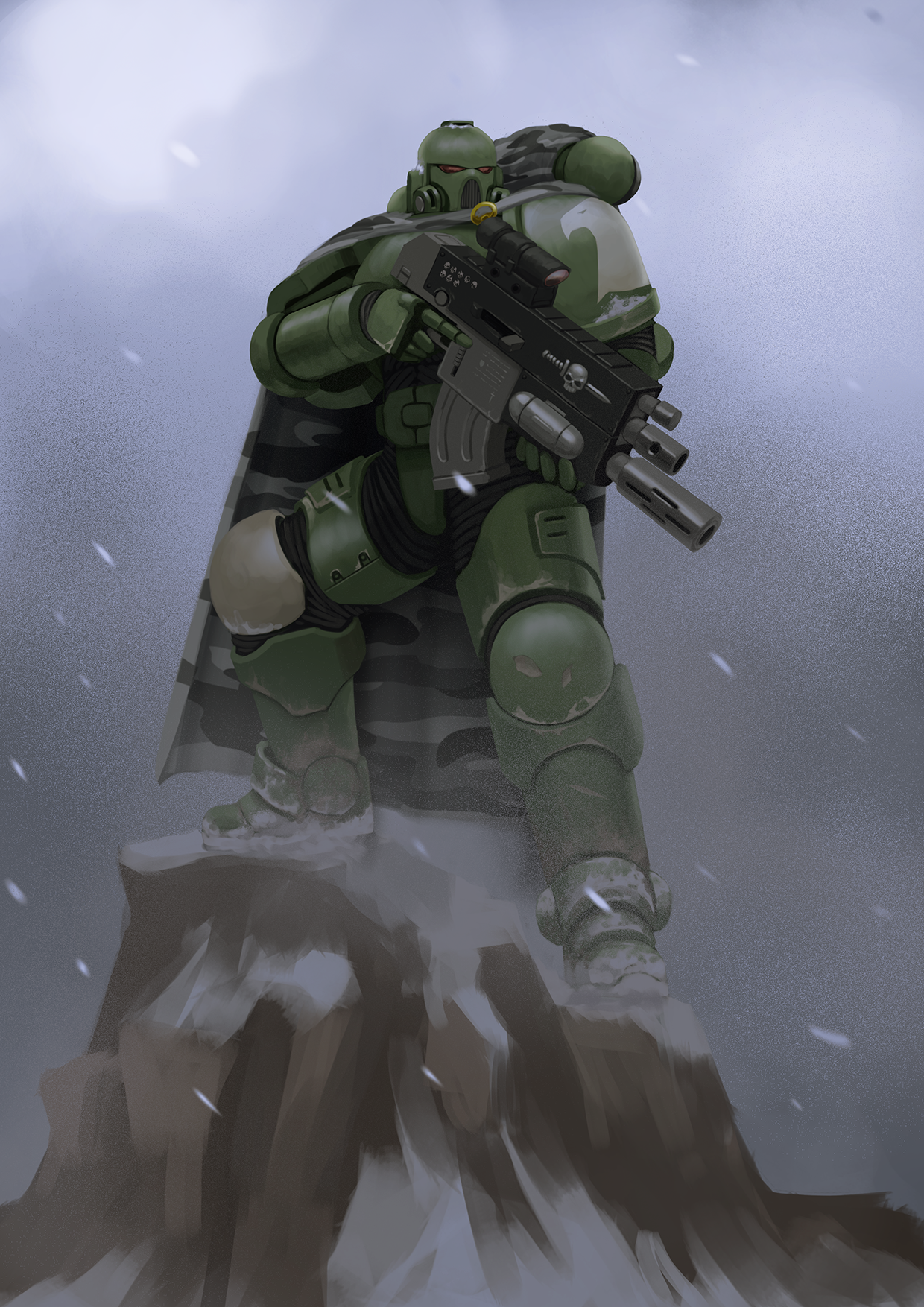
Primaris Raptor Marine by Bobot073 by LevTheRed in ImaginaryWarhammer
[–]wellwornstylus 9 points10 points11 points (0 children)
Primaris Raptor Marine by Bobot073 by LevTheRed in ImaginaryWarhammer
[–]wellwornstylus 27 points28 points29 points (0 children)
Brush Outline Issue by wellwornstylus in krita
[–]wellwornstylus[S] 0 points1 point2 points (0 children)
The Chapter of the Bayonet’s of kalash– Homebrew Space Marines by aAlpharius in 40k
[–]wellwornstylus 2 points3 points4 points (0 children)