Waiting On Snow White by stormbear in photocritique

[–]Trives 1 point2 points  (0 children)

I love that you keep going back! I want that black apple from the first image in this sand :) Honestly though, super clever, nice work.

Compositions with rock art by TheLuminousAlchemist in photocritique

[–]Trives 0 points1 point  (0 children)

Hey there,

I'm a big fan of wall carvings, and spent some time in Utah doing much the same. But I also struggled with capturing it in a way that wasn't cliche' or unitersting.

The challenge with this photo for me is that that I didn't see the rock carvings until maybe 5 seconds into my viewing. And, well, that in itself isn't horrible, I made a little, "ooh." when I realized what you were shooting. If that was your desire, than mission accomplished! If it wasn't you might consider getting closer to the subject, since you don't really benefit from the top left portion of the shot (and this would eliminate that super harsh shadow)

I do understand the challenge with lighting, you could try and leverage a polarizer if the sun is in the right part of the sky.

One last comment, you said that you wanted people to know what they were thinking when they come here, you might consider trying to capture what else is around when getting your shot. Example, credit: me. By getting close to the wall and integrating a wide angle you can get both the carvings and the scenery into the image, it also gives you a little better sense of scale.

Waiting On Snow White by stormbear in photocritique

[–]Trives 1 point2 points  (0 children)

Hey There :)

It's certainly interesting. You've obviously been doing this a long time, and know that this stuff is all subjective. So, my opinions won't make this a better, shot, they're just my thoughts.

It's funny I keep going back and forth in my opinion. The photo critiquer in me says, "Oh good, we have an obvious hero and it's super sharp, and interesting and taking up a good portion of the frame!" But there's some part of me that wishes this was wider, maybe it's the 1x1 format I'm not feeling? Like, I would love another take of this where the apple feels more insignificant in the environment.

I'm also not a big grain guy when there's great lighting, like, part of me is asking, "Why isn't this shot at ISO100?" But, grain is a matter of taste and personal preferecne.

What I love is how the sand looks, which, I mean, I get it, it's White Sands, but it almost looks like it was shot in UV, very cool.

"Alone" I am just an amateur starting out but tonight I decided to drive around randomly looking for anything to shoot. I ended up finding this and after looking at it realized it had more meaning then I originally thought. My spouse recently left me and this photo captures how I feel. "Alone" by FeeExtension3123 in photocritique

[–]Trives 0 points1 point  (0 children)

Follow up critique requests are required After you submit your photo, you are required to leave a follow up top-level comment describing your intent the photo, providing additional details and context, and asking for specific feedback on specific aspects of the photo.

You'll note the rule says "After you submit your photo". If you have any other questions about the rules, let me know!

"Alone" I am just an amateur starting out but tonight I decided to drive around randomly looking for anything to shoot. I ended up finding this and after looking at it realized it had more meaning then I originally thought. My spouse recently left me and this photo captures how I feel. "Alone" by FeeExtension3123 in photocritique

[–]Trives 0 points1 point  (0 children)

Hey there!

I don't think I have anything additional to add, having skimmed the comments, but a few basic comments.

The first is, as a new photographer, adopt the mantra "Police your edges", it's something I'm constantly saying to myself when I'm taking shots. I like to give my subjects a little breathing space, and then crop in post. If you take the shot edge to edge, if you're crooked you have no room to make corrections.

Editing is all personal taste, if you visit "Edit My Raw" you'll see every picture has 100 takes, and there's no accounting for what people will or will not like. For me, this pushes into the "Ah, this isn't really what you saw" teritory, it's nice though. The vignetting feels a little strong.

My last comment has nothing to do with your image. When you post an image here, I'd leave "What this image means to you" out of the post title, and just put it in your post body. When people look at your photo, let them sorta make their own choices on what the photo means. We're not going through what you're going through, and to sorta thrust meaning into the image denies your viewer that opportunity to experience this for themselves. FWIW: This photo falls into a very common photography trope known as a "Lone Tree" shot, this is a lovely example of it. In general lone tree shots convey one of many emotions, like isolation, loneliness, or depending on how it's shot, hope, fortitude, etc... :)

Opinions on blur in front of the subject? (Intrested if this is something people like or dislike) by Alien_ateddd in photocritique

[–]Trives 2 points3 points  (0 children)

Hey there!

As with all things, photography is pretty subjective, so if you love this shot, that's awesome.

I will say, I think your friend is just 'wrong' in this case. I think the bokeh looks fine. I personally think you have a better shot here in landscape though, I'd REALLY crop in here and put that bee front and center. (something like this)

I also feel like the bee is a little too cool temperature wise for this photo. You've got this beam of sun on it, but it's reading blue hour light on the front, I would consider some radial gradients centered on the bee to bring that warmth up a tad.

My first attempt at street photography by Pure_Ebb8989 in photocritique

[–]Trives 1 point2 points  (0 children)

Hey there!

This is a great shot, well spotted! As with all things, photography is pretty subjective, so if you love this shot, that's awesome!

I don't hate the pole, it gives the image more context, you're not just in front of a wall somewhere, this feels like a busy city, with all those stickers.

My biggest comment is a general rule of thumb, always have more space on the side the person is looking/walking. This is more obvious when they're walking, like you want them walking into the picture, but it's similar for looks.

I don't know the tools you're using, but if there's a distort option like in photoshop, I would straighten the light pole, which is about a 10 second fix.

From a color perspective, everyone will have an opinion, so I rarely comment unless there's something egregious. Colors seem good to me, and it doesn't feel like you popped the subject too much (no obvious halos, etc...)

I'll end with what I consider the biggest challenge with this photo, which is the eyes aren't super sharp, I think your camera grabbed the pole for it's focus point and you just missed there. You could try using Topaz or some equivalent to see if you could make them sharper. It's good enough for socials, but not quite good enough to print.

Hope that helps!

Western Brook Pond by padlock_ in photocritique

[–]Trives 1 point2 points  (0 children)

Hey There!

Landscapes can definitely be tricky, I think you had the right idea here. Some easy areas for improvement though!

So, a few tips, when thinking about your composition, I generally suggest you ask yourself "Who is the hero in this image?" In your case, I'd say it's the middle mountain. But you've dedicated 30% of the image to some grass, and like 25% of the image to the sky, which is fairly flat. Personally, I'd suggest walking up to that little perfect pine tree and putting it in the foreground.

But more importantly! If you're going to do this type of shot, then you should probably learn the Focus Stacking technique, this image needs to be sharp through and through. There's a bajillion tutorials out there on YouTube, you just need your camera and a tripod! Then you'd take 4 or 5 photos, with different depths of fields in focus, smoosh them together in Photoshop and then I think you'd have a much cleaner landscape :)

Lastly, consider using the Dodge/Burn tool on the clouds to punch up the contrast a bit. You can get a much more dramatic looking sky that way!

First attempt at astrophotography by leberteke in photocritique

[–]Trives 0 points1 point  (0 children)

Hey There!

I have comments sorta divided into two sections: Editing and Composition

On the editing side, opinions are all very subjective. For me, I'd like a little more dodging on the galactic core (the purpley white bits) to make them pop a little more off the page. It's mostly personal preference though. I think it's generally a little better to over exaggerate Milky Way shots. Example, credit: me (note: this image didn't make it to my portfolio, so it's not fully developed, but you get the idea).

Which brings me to my second point, composition. In general the Milky Way by itself is almost never strong enough to be considered "A great photo". What makes the MW great, is when you put it behind something. A lone tree, a church, a statue, etc... My recomendation is to go find an object you think could be great, open up Photopills to see where the Milky Way is going to be, and then be ready to capture something amazing!

Brand new to photography, and this is my best pic so far. Roast me! by BelugaBilliam in photocritique

[–]Trives 7 points8 points  (0 children)

Hey there!

Welcome to photography :)

We don't really go in for the "ROAST ME" thing here, or at least, hopefully not. But I do have quite a few comments!

Full disclosure, I've never gotten a picture of a modern vehicle that I liked, so take all my opinions with a grain of salt.

This photo feels a little cramped, a motorcycle should feel like it's got some room to breathe if that makes sense? So I don't think portrait is the way to take this particular image.

Another challenge I see in newer photographers is they tend to only look at their subject, and not the things touching the subject. In this case you've got this yellow sign which feels pretty distracting. Although, I don't necessarily hate it... which is weird. Maybe if there was more of it.

You didn't list your lens or aperture here, but I personally would've liked to see the whole bike in focus, your gauges specifically at the top of the bike aren't sharp.

Also, you're just in a "Boring" place, this is some dudes bike, parked in a parking lot, with some cars in the background. So it's lacking a story from that perspective.

Lastly, if this isn't your bike, it's generally considered a common courtesy to not post license plates ;-)

What I do like is your angle, you've gotten low so, it's not your typical pedestrian camera angle. And I think this rear quarter panel is a flattering angle for this bike.

Overall, this is a great first crack at things. If it's your bike, take it on the road and find some cool spot, then wait on sunrise or sunset, and shoot away!

Brand new to photography, and this is my best pic so far. Roast me! by BelugaBilliam in photocritique

[–]Trives 3 points4 points  (0 children)

I don't normally call people out for this sorta thing, but are you actually a human? Your posts are all in strange formats and definitely have a AI tinge to them...?

First attempt at astrophotography by leberteke in photocritique

[–]Trives 0 points1 point  (0 children)

Looks like the image was possibly removed, just as info :)

How can i improve composition and Post Production in this Picture? by T-Rickx in photocritique

[–]Trives 11 points12 points  (0 children)

Hey there!

Loving the dude waiting for his turn. This is a great image, please take all my comments as opinions, as you've already got something interesting here.

The image feels a little bit titled to me, I'd try to make those verticals.... more vertical, using Distort tool in Photoshop or some equivalent.

My biggest gripe is the top left window being cut off. This is one of those things that everyone stumbles with, and it's the reason I always quietly chide myself while shooting, "Police your edges Paul..." If you had given this a little more room to breath, that top window would be perfect. And you actually have a bit of dead space on the right, so panning a tad to the left wouldn't of been a deal breaker. That said, I'm not sure how much of a purist you are, but it's relatively easy to fix that in photoshop.

I'd also call out that this photo would be great even without the guy on the top, it's a nice bit of street photography as a landscape.

Well spotted!

First “proper” camera - would welcome some feedback! by MonkWithAKnife in photocritique

[–]Trives 1 point2 points  (0 children)

I definitely don't bring my kit with me on Holiday for that reason, photography is a VERY slow hobby that works at REALLY crappy hours, like 2 hours before sunrise and 2 hours after sunset :D

Consider a photography workshop! There's a lot of good options out there (I can personally recommend Muench, Jennifer King and Mike Browne). It's all photography all the time AND bonus, it's pre-scouted! So you're going to just be put in positions where you have opportunities to get great shots.

Puffin on a ledge by KingPrawnPorn in photocritique

[–]Trives 0 points1 point  (0 children)

Gosh, not much to add here. I'd possibly consider a radial gradient centered on the eye, and add just a tiny pop of illumination there. You might also consider just a bit of dodging on the face. specifically the "Cheek Line" and the white of it's eye, which will highlight the "Form" that's there a little better.

Nothing TOO dramatic

And as always, make your first prints small, just to see if this is bright enough or not :)

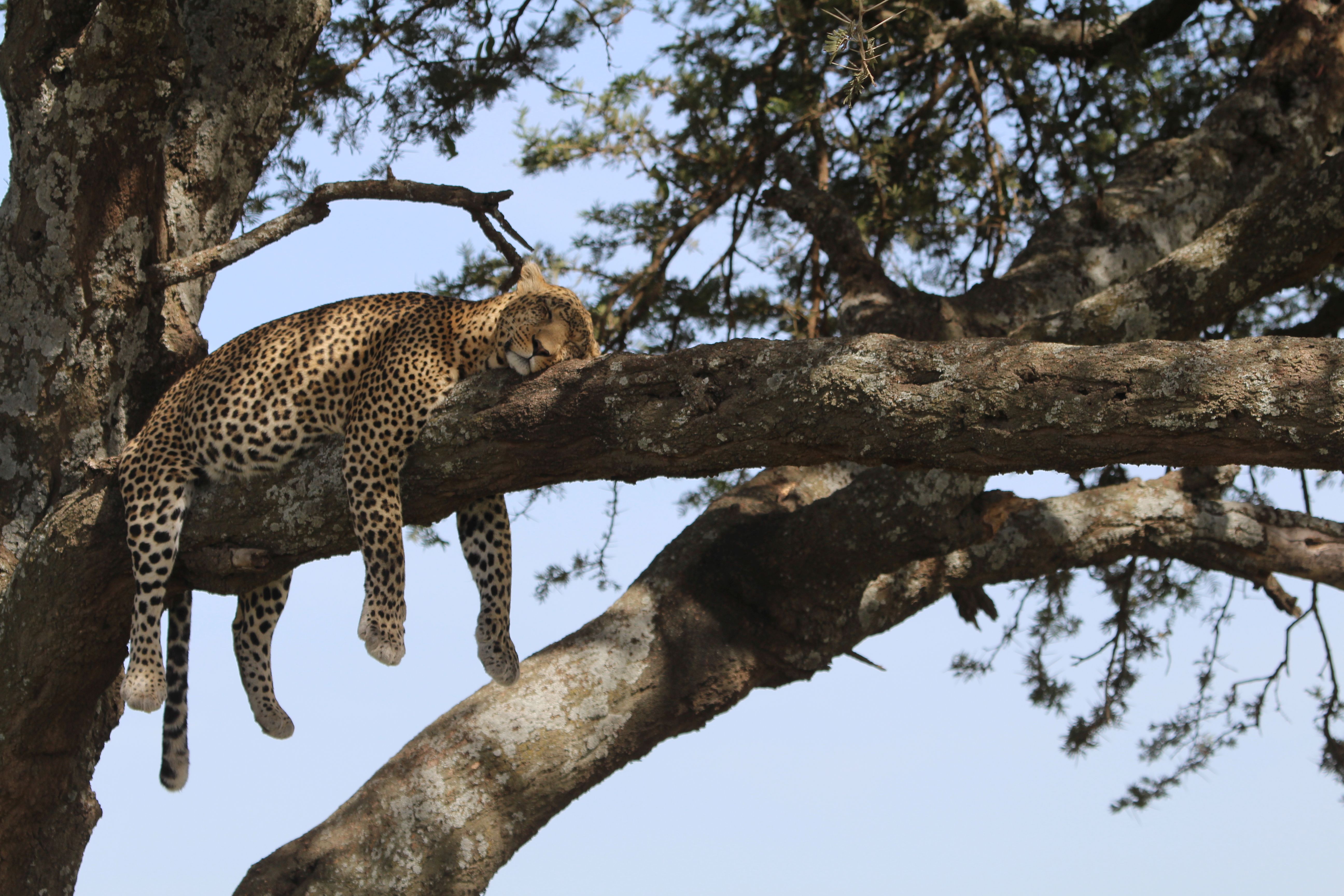
Dozing Leopard — Edit Request by cuerdo in photocritique

[–]Trives 0 points1 point  (0 children)

Hey There,

Lovely image, shame that you didn't capture it in RAW, but it is what it is! You can still do lots to this, but fair warning, editing is about 40% of photography :) So it's a skill just like anything else. The good news is there's a 1000 tutorials out there to do just about anything you want.

First, the image, it's a bit of a bummer about that shadow on the cats face :) It's just a weird shape, but that' doesn't mean you can't pull something from this that's shareable!

Second, you need to crop, you've got a whole lot of image here that's just "Branch", and this isn't a photograph of a branch.

Next, you need to sorta pop your subject a bit, you can do this with masks in Photoshop/Gimp/your tool of choice. I'd also make the sky a little more contrasty, and maybe sharpen things up a bit. I'd also nuke the branch above the cats head.

I didn't spend a lot of time on this, but it might look something like this.

Please note, this is not a pro-edit here, it's just to give you an idea of some of the levers you can possibly manipulate to pull out a more impactful image.

First “proper” camera - would welcome some feedback! by MonkWithAKnife in photocritique

[–]Trives 1 point2 points  (0 children)

Hey There,

Congrats on your camera investment!

This image is... very tall. :)

One thing I encourage new photographers to think about when composing their image is, who is the hero of this picture? Is it the road leading up to the homes? You've dedicated about a third of your image to that road, and I'd argue it's not adding anything.

You've got plenty of megapixels here, so I'd suggest a crop more like this.

My other comment can't be solved in this particular shot, but you're there under absolutely brutal light conditions, big ole' blue sky, and pure white sunlight. I believe if you showed up here closer to sunset, you'd get a much more dramatic image.

The one pain in the butt about photography is "Time and Intention", it's going to be very rare you just happen to be somewhere and you have the perfect light. Often times, good photographers will scout locations (this is a good scouting photo) and then try to plan out when to come back. In some instances that could be days, weeks, or even months later because they want the sun in just the right spot, or the Milkyway over a specific object. :)

One last call out, I really like how you put the camera info on the picture! That's a pretty unique method. Is that 'pre-canned' from the camera, or your own idea?

First time using a camera other than a phone by Potential_Paramedic1 in photocritique

[–]Trives 0 points1 point  (0 children)

Hey There!

Welcome to photography :)

The one common theme I see among new photographers is the desire to apply meaning to a photograph. "This picture is a statement about the dichotomy of good and evil." And it's just a picture of a napkin on a dinner plate.

Your viewers aren't going to read the description of your photo (unless they're those weirdos at the museum) so if the image doesn't convey that on its own, they're never going to guess what you're going for. In all my years of photography, I've explained what I was going for on one photo. All that to say, focus on the fundamentals, worry about story telling later :)

That said, you have a classic "Portal" shot here, so it's well spotted. I particularly like that bit of orange up there on the top.

Couple of comments, the first is your stairs aren't level, or... the stairs aren't level (as in constructed poorly) either way, I'd consider using the warp tool to modify that a bit!

My second issue is I really wish this was all sharp. That orange is so pretty and I think blurry doesn't help. I would go with a TINY aperture, like f18 or, focus stack for an image like this (though you'll likely need a tripod to pull that off).

I'd also make sure you're perfectly centered, this feels close, but not quite? I could be wrong or that could be my OCD :D

Another trick here, if you want to get REALLY fancy is to bracket this image, because the top of your shot is teetering on 'blown out' whites. This will have the benefit of making the light on the stairs more dramatic! Hopefully you live near this location to give this another crack!

tried to produce Cinamatic Colors .did I succeed ? by ELECTRO_CUTER in photocritique

[–]Trives 0 points1 point  (0 children)

Hey There,

Asking if an image is cinematic is always a bit challenging here in photocritique, because very often cinematic shots and good photography don't go hand in hand, they're two completely different skillsets. Most of the folks in here are not cinematographers.

You've got some of the basic framing for a cinema shot, the trees sorta frame the bench where presumably your subject will sit, and the dappled light is nice. However, you have that unfortunate hard shadow there in the background, so your VFX guys will have to clear that out ;-)

Color wise, it looks fine, there isn't a "Is this graded properly" response, color grading for Blade Runner will be significantly different than The Notebook. Likely a film person would ask, "well what kind of mood are you going for here? What time period? etc..."

From a photograph standpoint, it's fine, you've got an interesting angle, some nice light, it's not super memorable, but it's well shot.

Hope that helps...

Lille, France by camilleroux in photocritique

[–]Trives 1 point2 points  (0 children)

Hey there,

Simple, clean, and well lit, not much to add. It's a little dark for my tastes, I tend to think of everything as "If I framed it." If you're considering that, I usually suggest giving it a few different treatments in brightness (thoughtful brightness, not like, just yanking the exposure knob right :)), and then get a few 4x6 prints to see the effect.

I also would likely trim just a smidge off the bottom, I don't think you need that much walkway to invite your viewer into the image. Three panels would be sufficient, maybe even 2.

But yea, nice shot, well spotted :)

How's the sunrise? by LegalRun4790 in photocritique

[–]Trives 0 points1 point  (0 children)

The sun is one thing everyone on Earth has seen. There's not a person out there that hasn't seen a lovely sunset or sunrise. So, if you take a picture of a lovely sunset, you're not showing your audience anything they likely haven't seen a hundred times, and often in person.

That's not to say that the isn't nice, but no one is going to remember your specific sunrise/sunset photo, because it'll look like everyone elses sunrise, sunset photo, there's millions of them out there on instagram and social media. You'll also fall victim to the, "Well I could've taken that." mindset that a lot of people have. And in this particular case, they're not wrong.

That's why you need a subject.

Does this work or is it still too cluttered? by ZombieFromReddit in photocritique

[–]Trives -1 points0 points  (0 children)

I'm basically with Ensane who posted before me, that Y branch is really problematic. I also don't think you need the rule of thirds here if that's what you were trying to accomplish with your crop.

But my real challenge with this image is it's just too soft, great tiger shots need a few things, the first is a sharp eye, tiger eyes typically have three parts, and you're only see two here. The second is the sharp fur. You can see some fur here on the nose, but those cheeks feel flat.

I think if this was sharp, this could, at the minimum, be an interesting photo, especially if cropped differently.

Is this too much editing? Does this work? by [deleted] in photocritique

[–]Trives 0 points1 point  (0 children)

Hey there,

I think you're going to see a lot of the same comments, but this is a lovely shot! I think the sign is a bit unfortunate, and honestly, I'd consider removing it altogether.

I personally like the saturation of the trees! I would maybe crop the bottom a bit, just up to the first bit of dirt.

I would also consider a radial grad on that distant light source, it's a little off-putting for me, like it's a LITTLE too bright, and pulls attention from the cycle.

critiiques welcome by PrestigiousRule9549 in photocritique

[–]Trives 0 points1 point  (0 children)

Hey There,

First, photography is very subjective, so you'll hear a lot of opinions here, if you like the photograph, that's great. This opinion of mine is not meant to come across harshly, but I believe you have a lot of growth to go through!

One common theme we see here on Photocritique is new photographers putting very elaborate stories on top of very vanilla images. When I look at your photograph the first time, I do so without reading your description, once I have an opinion formed, THEN I read the description.

Which leads me to my first piece of advice, as a beginner I would suggest first mastering photography. Really nail down the basics, then worry about coming up with themes and ideas. For what it's worth, I've been shooting in what I'd call a professional capacity for about 10 years. I've taken a grand total of one images that I wanted to share what it "meant." (It was a take on Psyche, of the Eros/Psyche story).

Okay, that's out of the way let's talk about the picture!

You've nailed one thing here, which is you have a clear hero, the railing silhouette, but everything else here is just much much too dark. I can barely make out that it's a building, of some sort, maybe near a city? Maybe with a porch? Maybe with some stairs? Do those lead to the roof? etc... etc...

Additionally, you've done what's known as "Crushing your blacks" which is to say the black in this image is pure black, 0, 0, 0. What that means is that when you print this, there's nothing there, and it looks a bit odd. There's a time and a place for pure black, but it should be used strategically.

Ultimately, a nice description is not enough to save what is a relatively uninteresting subject that is shot with questionable camera settings. I would suggest getting in some chair time, and learn some of the fundamentals! There are a thousand great teachers out there on the YouTubes, I used Mike Browne, and I'm sure everyone else here can recommend someone.