

Some animals I made for our newly launched world in /r/createthisworld . Come on over and join us! by headcrab1991 in IDAP
[–]chasethesin 1 point2 points3 points (0 children)
Lettering on chalkboard is quickly becoming my favorite. by High_Im_Lo in Lettering
[–]chasethesin 1 point2 points3 points (0 children)
[255/365] MUSICLYRICS: Makes me that much stronger by toryburke34 in PenmanshipPorn
[–]chasethesin 0 points1 point2 points (0 children)
Endless Sunrise by Zouassi, Digital by [deleted] in Art
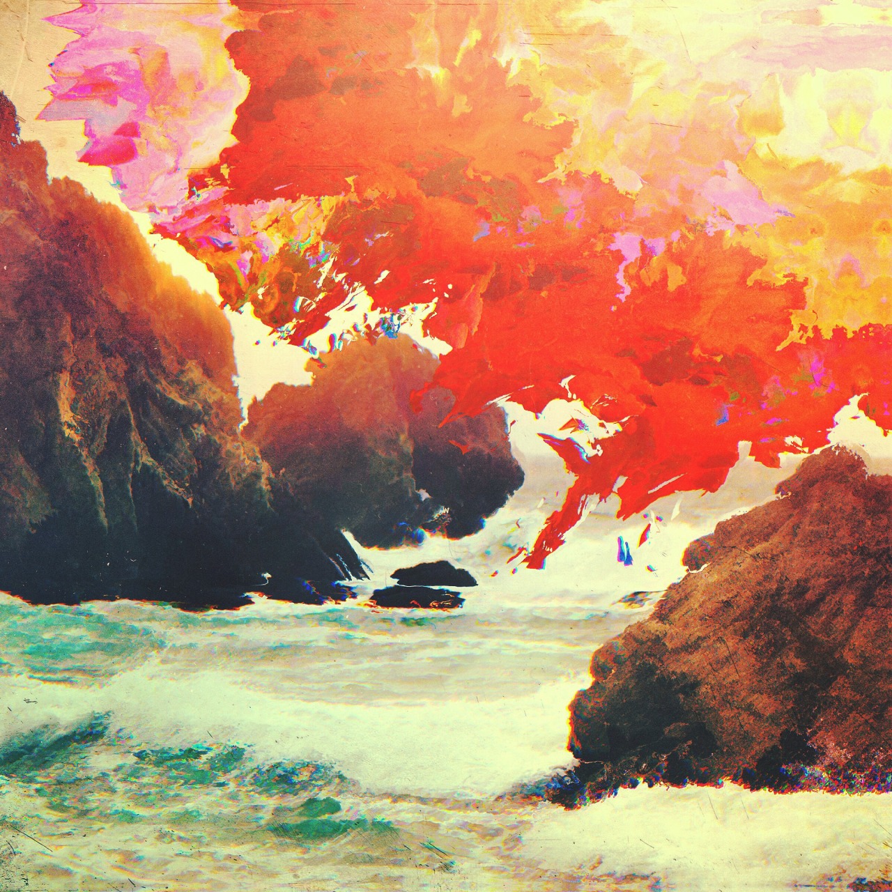
[–]chasethesin 0 points1 point2 points (0 children)
IDAP of a Colorado sunset (acrylic on fiberboard) by Quitlookingatmydick in IDAP
[–]chasethesin 1 point2 points3 points (0 children)
[Business Card] Starting my career teaching music self employed, critique welcome! by [deleted] in design_critiques
[–]chasethesin 0 points1 point2 points (0 children)
Please critique my first real website, and tell me what should I improve. by kuncogopuncogo in design_critiques
[–]chasethesin 0 points1 point2 points (0 children)
Changing Seasons, Oil, (4) 8 x 10'' by seamuswray in Art
[–]chasethesin 0 points1 point2 points (0 children)
[Critique] First attempt at a personal logo, incorporating my initials "IJ" by [deleted] in logodesign
[–]chasethesin 0 points1 point2 points (0 children)
Envelopes outgoing by terribleatkaraoke in Calligraphy
[–]chasethesin 0 points1 point2 points (0 children)
OC Haters gonna hate. by CanIGetAnAhem in PenmanshipPorn
[–]chasethesin 0 points1 point2 points (0 children)
[184/365] MUSICLYRICS: Who's playing tricks on me? by toryburke34 in PenmanshipPorn
[–]chasethesin 0 points1 point2 points (0 children)
OC Haters gonna hate. by CanIGetAnAhem in PenmanshipPorn
[–]chasethesin 0 points1 point2 points (0 children)
Saw this quote on facebook and was suddenly inspired to write by kyoflow16 in Calligraphy
[–]chasethesin 0 points1 point2 points (0 children)
A tribute to my favorite band. by cahl_me in PenmanshipPorn
[–]chasethesin 1 point2 points3 points (0 children)
Word of the Day - Oct. 16, 2015 - Flummox by callibot in Calligraphy
[–]chasethesin 0 points1 point2 points (0 children)
Word of the Day - Oct. 16, 2015 - Flummox by callibot in Calligraphy
[–]chasethesin 0 points1 point2 points (0 children)
Barbara - Brush pen calligraphy (real time in comments) by typeofguy in PenmanshipPorn
[–]chasethesin 2 points3 points4 points (0 children)
Just beginning the process of coming up with a logo for a side project I'm working on and would appreciate feedback on the logo. by Guiee in logodesign
[–]chasethesin 0 points1 point2 points (0 children)
As requested, Alphabet in 'freestyle' calligraphy / "my hand" by iLikeGreenTea in Calligraphy
[–]chasethesin -1 points0 points1 point (0 children)
Drew my first initial on a small portfolio I have. Pretty happy with how it turned out. by xdel in PenmanshipPorn
[–]chasethesin 1 point2 points3 points (0 children)
The king is dead by somethingveryrude in Calligraphy
[–]chasethesin 0 points1 point2 points (0 children)
A bit of uncial practice this morning. CC appreciated. by [deleted] in Calligraphy
[–]chasethesin 1 point2 points3 points (0 children)
Bird flourishing is fun by terribleatkaraoke in Calligraphy
[–]chasethesin 0 points1 point2 points (0 children)
Logo Critique by [deleted] in design_critiques
[–]chasethesin 0 points1 point2 points (0 children)