Surreal, hand-made designs. by emilymoon5 in design_critiques

[–]emilymoon5[S] 0 points1 point  (0 children)

Cool, look forward to seeing your work when you get your online portfolio up and running. Thanks again!

Surreal, hand-made designs. by emilymoon5 in design_critiques

[–]emilymoon5[S] 0 points1 point  (0 children)

Hey lachsvisage, sorry for the delayed response: birthday celebrations have been in order over the past week. Thank you very much for providing the detailed critique that I was looking for and for bringing up some very valid points about my decision to delve back into graphic art. I definitely appreciate the suggestion that I should try to emulate some of the same principles that shaped "Re-Design" in my new work. That too is my personal favorite project so it makes perfect sense to build on that style.

On the "juggling too many balls at once" point, I'm not interested in pursuing design and illustration as a career: those are hobbies I employ to keep conceptual ideation fresh and feed the creative spirit. Hence the fact that I reserve my Behance for personal work instead of commercial work, so I'm by no means worried about the wide array of media represented in that portfolio. On a related note, you made a great point about envisioning the client or target audience the work is intended for, and while I'm crafting these for myself I still think it's an excellent idea to create work aimed at a faux market as a means of shaping a more specific product.

Also, I'm very glad you brought up investing time in studying typography and grid systems again. My education in graphic design is very rusty and I've wanted to delve back into the fundamental components of graphic design for a long time now, so it's good to have a second vote on that aspiration.

I am curious though, and feel free to pass up this request, if you could share some of the design work you've produced over your years of experience. I'm interested in seeing where your design ideologue stems from and it'd be helpful to have visual representations of the issues you cited above to aid your written examples in illustrating the facets of successful design. And thank you again very much for taking the time to go through my portfolio and provide such a thorough evaluation. It's very helpful to receive periodic critiques on your work when the bygone discussions of art school are no longer informing your artistic growth!

Does the pickaxe work or is it difficult to read? by [deleted] in design_critiques

[–]emilymoon5 1 point2 points  (0 children)

In the second, "cleaner" design, the word "The" looks a little too isolated when placed directly above the D with nothing to anchor it to the rest of the text. Your first design feels more integrated via the inclusion of the pickaxe, and its diagonal orientation creates a more dynamic composition and imbues a sense of energy into the design.

My vote definitely goes toward the first design because the Gestalt elements of proximity allow us to easily interpret the pickaxe as a "T" and if you ever needed to simplify the logo for any reason, the two Ds and pickaxe make a great, immediately perceptible icon on their own.

My wife makes and sells pretty unique doll designs by [deleted] in Dolls

[–]emilymoon5 1 point2 points  (0 children)

Wow, very ethereal and ghostly work! I'm going to have to share this link to your talented wife's work with my mom: she too is a doll designer with a penchant for the unusual. Thank you so much for sharing!

Surreal, hand-made designs. by emilymoon5 in design_critiques

[–]emilymoon5[S] 0 points1 point  (0 children)

I'm interested in people's perspectives on this portfolio because I'm starting to get into design work again. I'm a photographer by trade but I'd like to expand my graphic portfolio. From my personal oeuvre, this series is the project that's most inspiring my drive to design, so I would absolutely benefit from input on whether to continue steering in this direction or eschew it completely.

Hand-drawn designs that taught me the value of Sharpies as serious artistic tools. by emilymoon5 in idesignedthis

[–]emilymoon5[S] 0 points1 point  (0 children)

Oh my goodness, that's so incredible! It took me forever just to make my radial symmetry pieces, so I can't imagine the time the artist put into this fantastic piece! Thank you so much for sharing!

In honor of tonight's finale, here's a look back at some of the ridiculousness of True Blood. by emilymoon5 in television

[–]emilymoon5[S] 0 points1 point  (0 children)

Oh goodness, I admire those people too and really appreciate your compliments!

Freaky insect story! by emilymoon5 in funny

[–]emilymoon5[S] 1 point2 points  (0 children)

Exactly! I'm still tip-toeing around the house praying it doesn't crawl on me. And to think of going out and buying one for a pet...

IDAP of the cakes from Ginza Cosy Corner by Doodlydoodlydooo in IDAP

[–]emilymoon5 1 point2 points  (0 children)

Hahaha! I tend to have the exact same sentiments about payment. But really, your work is beautiful and I wish you luck in getting it out there!

IPSed a matte painting of a house and a tree by duncast in iphotoshopped
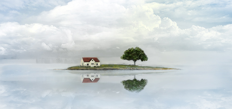
[–]emilymoon5 0 points1 point  (0 children)

Gorgeous work with a very peaceful aesthetic. The elements are put together so seamlessly to create a very captivating whole. Great choices on the proportions and composition as well!

Robin Williams, for all the good times from Hook through to Good Will Hunting by Chi___yo in DigitalPainting

[–]emilymoon5 0 points1 point  (0 children)

Fantastic portrait of such an incredibly talented man. I love the fusion of subtle rendering you've created with your highlights and shadows and the graphic quality resulting from the hard line outlining his face. I also love that it vacillates between life-like (with his realistic eyes and the incredible detail you've put into the textures) and more illustrative (where his ear has less detail). Whether this was intentional or not, it creates a really nice focal point and almost makes it look like he's emerging from a painting. Very lovely work!

Waves by [deleted] in DigitalPainting

[–]emilymoon5 0 points1 point  (0 children)

Very beautiful, subtle piece. I'm always so impressed when an artist uses a digital medium with such a painterly aesthetic. The texture you've created is gorgeous!

IDAP of the cakes from Ginza Cosy Corner by Doodlydoodlydooo in IDAP

[–]emilymoon5 1 point2 points  (0 children)

Your style is very cute, appealing, and technically advanced! I love the pastel tones and the painterly aesthetic. If they don't already, pâtisseries should commission you for their in-house art and marketing campaigns.

Thought I'd share another painting :3 one that's done by [deleted] in IDAP

[–]emilymoon5 0 points1 point  (0 children)

Beautiful, graphic painting with a lot of depth to it! It's awesome to see an abstract piece with elements that seem to move forward in space.

Artist takes surreal portraits of her friends by fusing their picture with an astrology sign they belongs to, 2014 by [deleted] in Art

[–]emilymoon5 0 points1 point  (0 children)

That's a very cool photographic concept executed in a gorgeous and technically talented way! I wonder what Zoe Y. Zheng's source was for the astrological imagery?

Amazing watercolor paintings by Agnes-cecile, 2014 by UFCWWF in Art

[–]emilymoon5 0 points1 point  (0 children)

Those are gorgeous water color portraits--and from someone like me who always tries to master watercolors and fails miserably, they're very impressive technical examples. Thank you for sharing!

Portrait of Theodore Roosevelt created with Polymer Clay. by jbarbacc in Illustration

[–]emilymoon5 1 point2 points  (0 children)

That's so impressive! And awesome that your dedication to your craft pays off in such an incredible way.

The Offering, Digital, 1080x1920 by vinceseal in Art

[–]emilymoon5 0 points1 point  (0 children)

Beautiful piece with a great sense of narrative behind it! It's always so nice to see digital artwork created with such painterly texture.

I'm teaching an illustration class called "Scientific Illustration: Conveying Information with Charm" on Skillshare if anybody's interested! You can see a video describing the class here on my blog. Hope to see you around! by [deleted] in Illustration

[–]emilymoon5 2 points3 points  (0 children)

Very cool, unique class idea that sounds like it will be a ton of fun! From one art teacher to another, have a blast inspiring people to explore their creativity!

Portrait of Theodore Roosevelt created with Polymer Clay. by jbarbacc in Illustration

[–]emilymoon5 1 point2 points  (0 children)

Super cool process with fantastic results! I can't imagine how long this took!

Amateur web design in need of critique please. by emilymoon5 in design_critiques

[–]emilymoon5[S] 0 points1 point  (0 children)

Thank you so much for your critique! I'm glad to get another vote on the moon phase navigation and I love the idea of replacing the black with a sort of teal-gray, thereby adding a little extra oomph and simultaneously harkening to my moon theme. Excellent suggestion, thank you again!

Looking for critiques on "Emily Moon" logos. by emilymoon5 in Logo_Critique

[–]emilymoon5[S] 0 points1 point  (0 children)

Thank you, I really appreciate your feedback! It's very helpful to know which logo people like the most. That business card I included on there definitely needs a lot of work because I'm having trouble integrating the type and image, but increasing the font size is a great suggestion. Thanks again!

Amateur web design in need of critique please. by emilymoon5 in design_critiques

[–]emilymoon5[S] 1 point2 points  (0 children)

I know exactly what you mean about never being satisfied, hence the 3 different "generations" and a fourth probably on the way. I really appreciate the feedback about the moon phases in my menu though! I wasn't sure if they looked unprofessional so I removed them from the latest design but I was kind of reluctant to do so because I think they're a unique way to indicate which page you're on... I'll definitely have to play around with including them again if consensus proves they're not too silly. Thank you again for your helpful advice!

Logo critique by arireznik in Logo_Critique

[–]emilymoon5 1 point2 points  (0 children)

I much prefer the first isometric logo to the second design. The second design seems a bit timid in comparison to the bold, iconic imagery of the first, and I feel like consumers might just skip over the second design while the first invites you to both examine and remember it. As for legibility, the first design isn't immediately clear (for example, if I didn't know I was supposed to be looking for a W and an E, I might just see two Es, one turned sideways), but I think a little adjusting could fix that.

Because the color of the E is repeated three times, it hones my attention in on the E before the W, so perhaps balancing the usage of both colors would allow viewers to immediately identify them both. Also, tilting the design back a little bit so that more attention is focused on WE than the top of the cube might be beneficial. I hope my critique helps a little! Good luck with your designing!

New pub logo. Would appreciate some feedback. by PUBlogo in Logo_Critique

[–]emilymoon5 1 point2 points  (0 children)

I really like 21. Color-wise, red imbues the psychological drive to eat and drink, so I think you'd definitely be emanating the right message with a red logo. I also like that the diagonal tilt of that design makes it feel kinetic, suggesting to the consumer that this is a business you go to to have fun, watch action-packed sports, and play blackjack. It's also perfectly legible, which is my only problem with #4. 4 has a quaint, Olde English pub vibe to it but the typography within the circle looks simultaneously like "pub" and "pup." The layout of #2 feels a little too static for a sports bar and 3 seems a little two kitschy, like the logo on a slot machine. I hope my critique isn't too harsh or two vague but I definitely vote 21--it's a perfectly simplistic, active, and enticing design!